
Description
Designed for both developers and designers, this toolkit empowers you to swiftly create robust, enterprise-level user interfaces with unparalleled ease and efficiency.
| 📦 Package | Standard | Plus | Extended |
|---|---|---|---|
| Next.js Pages Router (JavaScript) | ✔︎ | ✔︎ | ✔︎ |
| Next.js App Router (JavaScript) – Contact support | ✔︎ | ✔︎ | ✔︎ |
| Next.js Starter project (JavaScript) | ✔︎ | ✔︎ | ✔︎ |
| Vite (JavaScript) | ✔︎ | ✔︎ | ✔︎ |
| Vite Starter template (JavaScript) | ✔︎ | ✔︎ | ✔︎ |
| Next.js Pages Router (TypeScript) | ❌ | ✔︎ | ✔︎ |
| Next.js App Router (TypeScript) | ❌ | ✔︎ | ✔︎ |
| Next.js Starter Project (TypeScript) | ❌ | ✔︎ | ✔︎ |
| Vite (TypeScript) | ❌ | ✔︎ | ✔︎ |
| Vite Starter template (TypeScript) | ❌ | ✔︎ | ✔︎ |
| Design Figma file – Preview | ❌ | ✔︎ | ✔︎ |
| ⚡️ License | |||
| Use in a free end product. | ✔︎ | ✔︎ | ✔︎ |
| Use in an end product that is “sold” (one or multiple paying End Users). | ❌ | ❌ | ✔︎ |
Features
- Blazing Performance
- Easy Theme Customization
- Light/Dark Color Modes
- Responsive Across Devices
- RTL Layout Support
- Multi-language Support
- Inclusive Accessibility
- Starter Templates
- 18 layout shells
- 16 app pages
- 91 form elements
- 676 components
- Forms validation with Zod
- Supabase Authentication
- React Context API
- React Hooks API
- Public & Private Routing System
- MUI X Charts
- Material UI v5.15.x
Blueprints & Pages
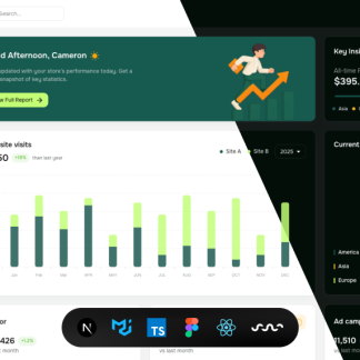
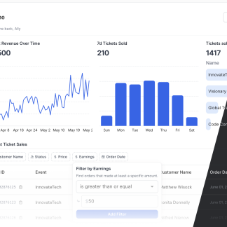
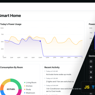
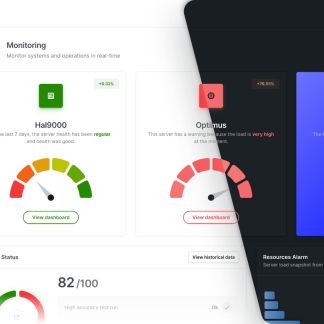
Application blueprints are pre-built, production-ready dashboard templates and are included in all our plans.
Dashboards (8)
Apps (7)
Pages (9)
- Users Listing
- Users Profile
- Projects
- Shop Front
- Shop Listing
- Shop Product Details
- Shop Product Create
- Invoices Listing
- Invoices Details
UI Components (676)
Get quick access to a wide array of UI components. Ready for any project, they’re built to integrate smoothly and enhance your user experience.
Application Shells (18 examples)
Layout (73 examples)
Elements (94 examples)
- Buttons
- Button Groups
- Toggle Buttons
- Badges
- Chips
- Avatars
- Dropdowns
- Ratings
- Accordions
- Progress Indicators
Navigation (61 examples)
Feedback (31 examples)
Headings (29 examples)
Overlays (45 examples)
Lists (62 examples)
Grid Data Display (103 examples)
- Data Grid Lists
- Stats Grid Lists
- Description Grid Lists
- Progress Grid Lists
- Image Grid Lists
- Icon Grid Lists
- Composed Blocks
Data visualization (69 examples)
- Area Charts
- Bar Charts
- Line Charts
- Sparkline Charts
- Gauge Indicators
- Pie & Doughnut Charts
- Composed Visualization Blocks
Forms (91 examples)
- Form Layouts
- User Auth
- Autocomplete
- Checkboxes
- Radio Groups
- Select
- Switches
- Textarea
- Input
- Upload
- Datepicker
- Slider
Updates and Support
All licenses give you access to:
- 1 year of free updates
- 6 months of technical support
Support Tickets
If you need help you can open a support ticket by sending an email to: support@uiforthelp.zendesk.com
Documentation
Click here to access the documentation
Built with:
Click here to view the dependencies list
Alex Delevi (verified owner) –
—
dimension: design-quality
—
kai wang (verified owner) –
—
dimension: flexibility
—
tech.produtos (verified owner) –
—
dimension: code-quality
—
clean code and beautiful ui, about 1 month ago
abusyman (verified owner) –
—
dimension: design-quality
—
An artwork, looking forward to your updates.
trent.strum (verified owner) –
—
dimension: customer-support
—
I initially had issues that were due to my skill level but the author was very kind and helpful. He arranged a video call to walk me through the template. It was extremely helpful and now I feel equiped to successfully use the template. It is a beautiful design with a full suite of components and is totally worth purchasing. I highly recommend both the product and the seller.
Blake Womble (verified owner) –
—
dimension: design-quality
—
Template looks really nice, but the Figma files are incomplete. There aren’t any instructions and some of the components are missing. Additionally, there are no Figma files or any components set up for dark mode. There aren’t any varaibles or tokens set and that makes it really difficult to adjust within Figma. I tried reaching out to both the seller and MUI but got no response from either. If you are only looking for the basic react components, I’m sure this provides some use, but since I was looking to use already made Figma components that I can pull into another web builder it didn’t meet my needs. Looks nice, but I wouldn’t recommend.